RELATIVE PERFORMANCE BY INDUSTRY
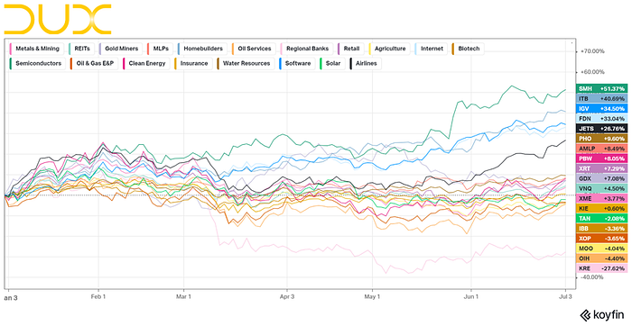
Over the past six months, the performance of various industries has been dominated by semiconductors and homebuilders. Additionally, consumer electronics and auto manufacturers have shown significant success thus far. When we shift our focus to more recent months, we observe that residential construction remains robust, and airlines have entered the scene due to the summer travel season.
Interestingly, in the past week, there has been a notable change in the leading industries mentioned earlier. Energy has finally made a strong appearance, while trucking has also secured a spot in the top five. We could be setting up for sector rotation. Remember, last year Large-Cap Growth Stocks were struggling in the second half of the year. What are the best performers this year? Large-cap growth stocks. Now we’re seeing rotation into small and mid-caps along with Industrial stocks that were the underperformers in the early part of 2023.
Considering the charts and looking ahead, my attention is now directed toward the following industries:
· Energy
· Travel
· Trucking
· Metal Fabrication
· Department Stores
FACTORS vs S&P500

Year-to-date (YTD), only Large-Cap Growth stocks have generated positive returns. This trend is reflected in the three-month (3M) chart above, where we can also observe a recent shift that resulted in Mid-Cap stocks starting to outperform the S&P index.

By examining different factors relative to the S&P index, we can see that IPOs have performed well this year. Given this information, we could consider it beneficial to incorporate IPO trading strategies into our repertoire.
COUNTRY ETFs

When looking at ETFs representing different countries and focusing on those that have performed better than the S&P index, two countries draw attention: Brazil and India. The Brazil ETF with the ticker symbol $EWZ and the India ETF with the ticker symbol $PIN have shown promising performance. However, despite Argentina’s strong numbers, issues like inflation and corruption make it less favorable for potential investments.
WORLD EQUITY INDICES
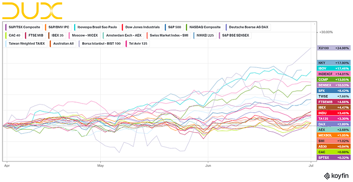
In the relative performance of World Equity Indices, of interest we see NKY (Japan Nikkei 225 Index) and IBOV (Ibovespa Brasil Sao Paulo Stock Exchange Index) outperforming the Nasdaq Composite and SPX. This again highlights the strength coming out of Brazil and reflects the recent theme of Japan, highlighted by Warren Buffet and his heavy investment in the country.
COMMODITIES

Feeder Cattle has demonstrated consistent performance throughout this year. It is also intriguing to observe Natural Gas finally displaying indications of a reversal from its downward trend. This development aligns with the theme of the recovery of the energy sector, prompting me to closely monitor it.
- $NG1: Ticker symbol for Natural Gas futures.

Visually, it is evident that commodities have experienced a prolonged period of stagnation over the past decade, with the chart indicating levels not seen since the dot-com bubble in 2000 or the gold de-pegging in 1970, both of which were followed by significant market upswings. This raises the question of whether commodities are poised for robust returns leading into 2030. Additionally, it is worth considering if this trend correlates with our current concerns and challenges surrounding inflation.
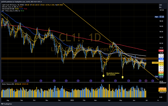
Oil is currently facing resistance from various moving averages (MA) and anchored average volume-weighted average price (AVWAP) levels. To be considered attractive, it needs to surpass the $75 mark.
SEASONALITY

The current presidential election cycle is following the pattern depicted on the chart. The market initially experiences a significant rise, followed by a period of slower growth and sideways trading for the remainder of the year. As the elections approach, there is typically an uptick in market activity, which is advantageous for the ruling party. This pattern allows them to highlight a strong economy, enabling them to boast about their accomplishments.

When examining the composite cycle, it becomes apparent that there is statistical strength expected for July, followed by a period of sideways trading for the remainder of the year. This deceleration in momentum aligns with the prevailing macro narrative, which currently reflects a sense of impending doom or a negative outlook.
July is the best month of the third quarter. The start of the second half brings an inflow of retirement funds
CHARTS
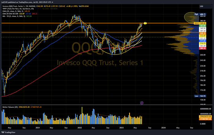
The price has reached a level where it might encounter resistance after forming a rounded bottom pattern. This could suggest the formation of a cup & handle pattern, which could mean a short-term pullback. Furthermore, based on the volume by price indicator, there doesn’t appear to be much significant resistance until reaching the previous all-time high level of around $408.

It seems that the transportation sector is getting ready to continue its upward trend after a slight retreat from the current resistance level. The rounding bottom formation is a positive sign. Moreover, the price is currently above important moving average and average volume-weighted average price levels, indicating strength in the sector.

Small-cap stocks are currently trading above their moving averages (MA). They need to surpass one more VWAP level (anchored to the high of this year) to show real strength. The volume-by-price indicator shows that there may not be many obstacles between the current price and the next significant resistance level, which is around $220.
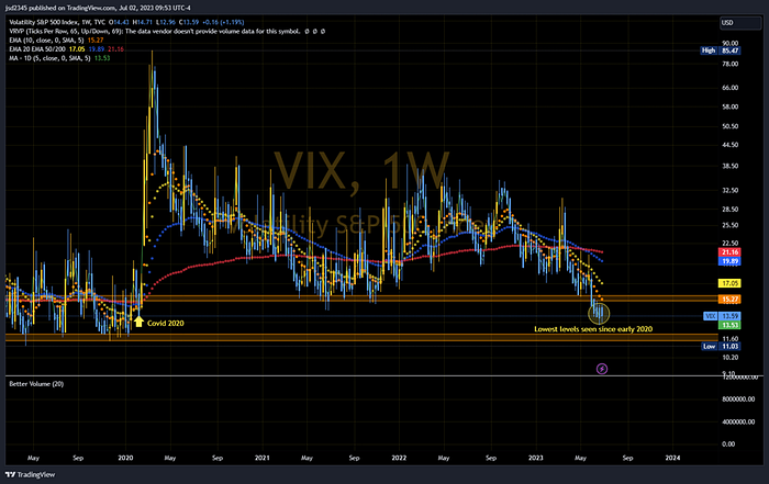
The VIX, also known as the CBOE Volatility Index, is a measure of market volatility and investor sentiment, often referred to as the “fear gauge” due to its inverse relationship with stock market performance. Can we expect VIX to stay at 2020 levels for long?

In the small-cap realm, growth stocks are gradually surpassing value stocks, as evident from the comparison between $IWO (iShares Russell 2000 Growth ETF) and $IWN (iShares Russell 2000 Value ETF).

The ratio $TIP/$IEF can provide insights into the relative performance or strength of TIPS (inflation-protected bonds) compared to intermediate-term Treasury bonds. A rising ratio indicates increased demand or outperformance of TIPS compared to Treasury bonds, potentially signaling expectations or concerns about inflation. Conversely, a declining ratio may suggest stronger performance or demand for Treasury bonds relative to TIPS, potentially indicating a preference for safer assets or lower inflation expectations. The ratio is showing sideways movement as it awaits the manifestation or absence of inflationary pressures.

The ratio $SPY/$TRJEFFCRB provides insights into the relative performance or strength of the S&P 500 stock market index compared to the CRB commodity index. A rising ratio may indicate stronger performance or outperformance of the stock market (represented by $SPY) relative to commodities (represented by $TRJEFFCRB). This could suggest investors’ preference for stocks over commodities. Conversely, a declining ratio may indicate stronger performance or demand for commodities relative to the stock market, which could suggest a preference for commodities over stocks.
Since approximately 2020, commodities have exhibited stronger performance compared to stocks. However, this year has seen a correction favoring stocks, particularly after reaching lows in 2022. Nevertheless, we are now approaching a potential resistance level derived from a long-term downtrend line. If this resistance holds, it could indicate a continuation of commodities outperforming stocks. This observation reinforces my belief that commodities are poised for a robust performance throughout this decade.

The relationship between $DXY and $SPY is often perceived as an inverse or negative correlation.
$DXY represents the US Dollar Index (DXY), which measures the value of the US dollar against a basket of major currencies, including the euro, Japanese yen, British pound, Canadian dollar, Swedish krona, and Swiss franc. It provides an indication of the strength or weakness of the US dollar relative to other currencies.
The inverse correlation between $DXY and $SPY is based on the assumption that when the US dollar strengthens, it may exert downward pressure on the stock market. A stronger dollar can make US exports relatively more expensive, potentially impacting corporate earnings and economic growth. As a result, when the dollar rises, it is often associated with a potential decline in stock market performance, and vice versa.
It’s worth noting that while this perceived relationship between $DXY and $SPY exists, correlations in financial markets can be complex and subject to various factors, including economic conditions, interest rates, geopolitical events, and investor sentiment. Therefore, it is important to conduct a comprehensive analysis and consider multiple factors when interpreting the relationship between $DXY and $SPY.
I take the current sideways movement as short-term bullish for equities
RECAP
Based on the observations from various charts and graphical representations, we can discern several key points. Commodities have outperformed stocks since around 2020, with a recent correction favoring stocks this year. However, we may be approaching a turning point suggesting a potential continuation of commodities outperforming stocks. This aligns with my theory of commodities being poised for a strong showing this decade. Notably, the energy sector may be ready for a comeback, trucking has shown strength, and there has been rotation into small/mid-caps and industrial stocks.